The
Active ISA
A Disability 3.0 Program
A symbol that reflects
who we actually are.
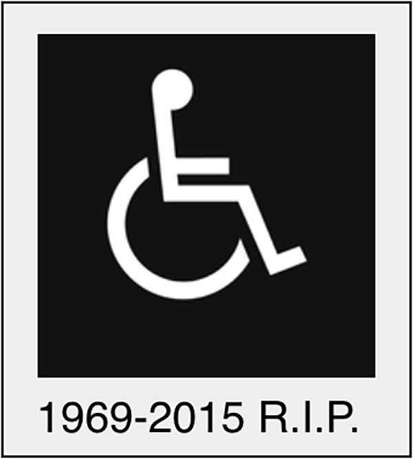
The first International Symbol of Accessibility (ISA) was designed in 1968. But the world has changed. People with disabilities have changed. The symbol hasn't — until now.
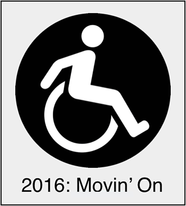
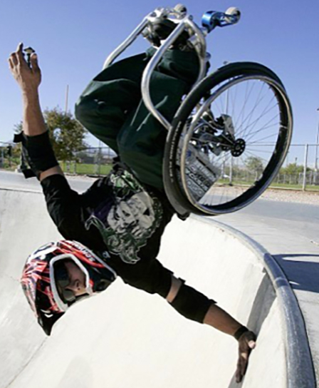
Erick Mikiten, FAIA — architect, wheelchair rider, and founder of Disability 3.0 — first encountered the Active ISA on a TriMet transit car in Portland, Oregon. It was the first time he didn't feel a flicker of hesitation about parking in a designated accessible spot. The old symbol says "push me" — passive, dependent, defined by limitation. The Active ISA says "I'm coming through" — self-directed, capable, present on our own terms. That shift in feeling is exactly the point.
And even when someone does need assistance — even when a push is genuinely welcome — human nature is the same for everyone: we want to feel like we're making our own choices. We want to feel in control. A symbol that communicates agency rather than passivity honors that, every single time someone rolls past it.
Erick obtained the graphic files directly from TriMet, refined them for architectural use, and for the past decade Mikiten Architecture and The Art of Access have been using the Active ISA on permitted projects and sharing the files with other architects — successfully, without a single rejection. Disability 3.0 is continuing that work: free downloads, consultation, and a growing network of buildings that say something truer about the people they serve.
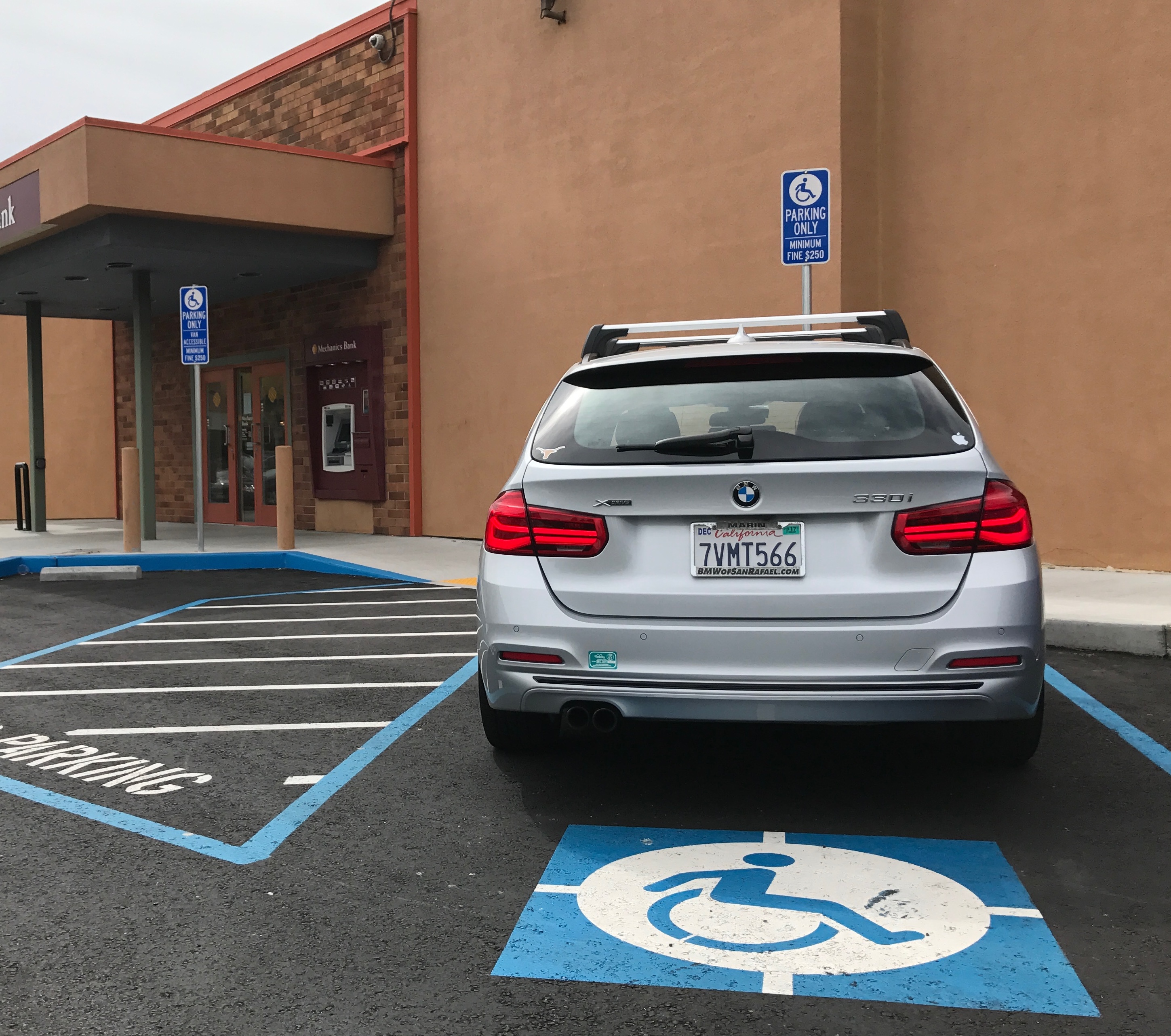
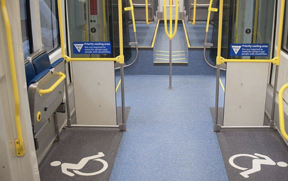
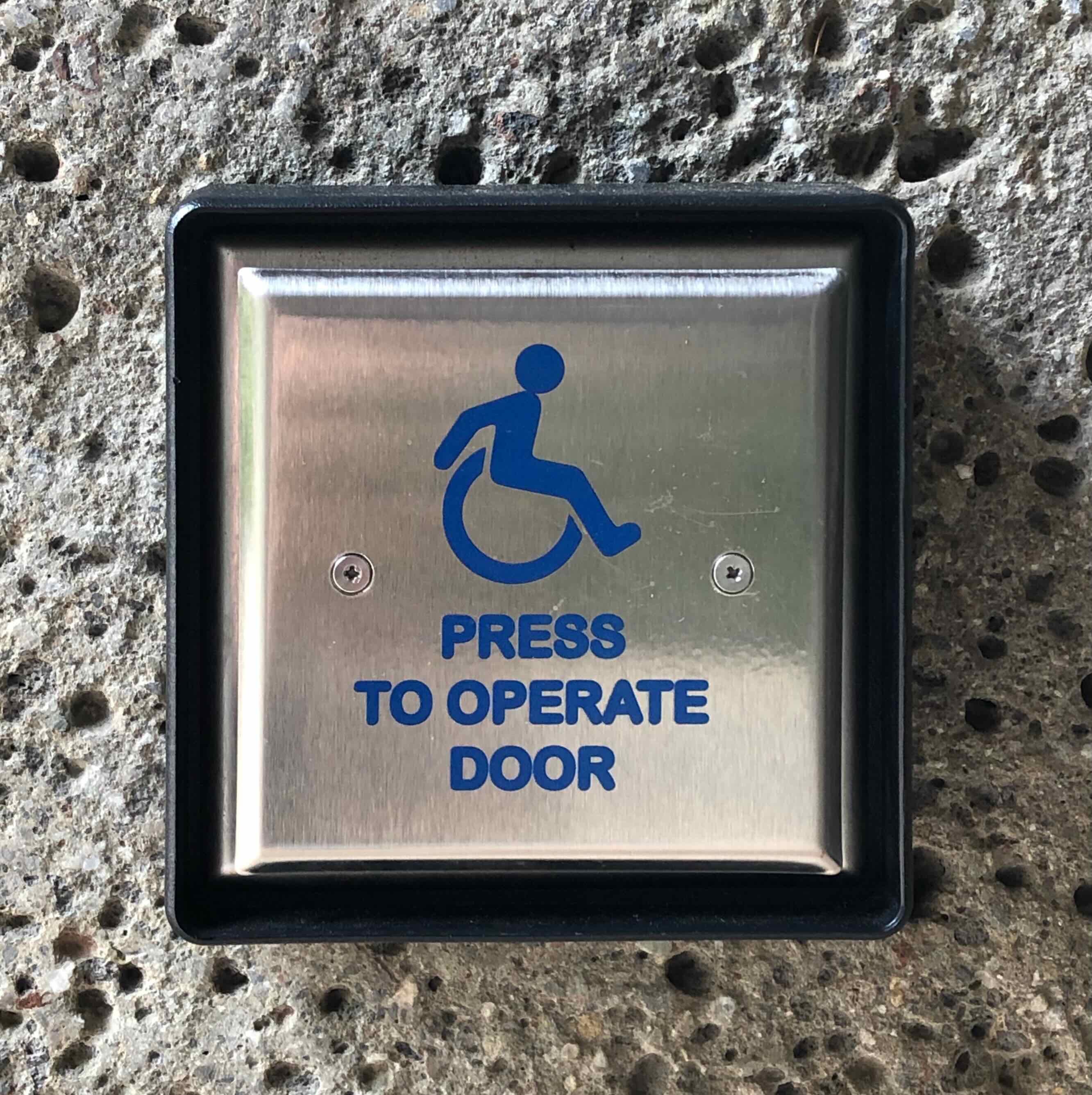
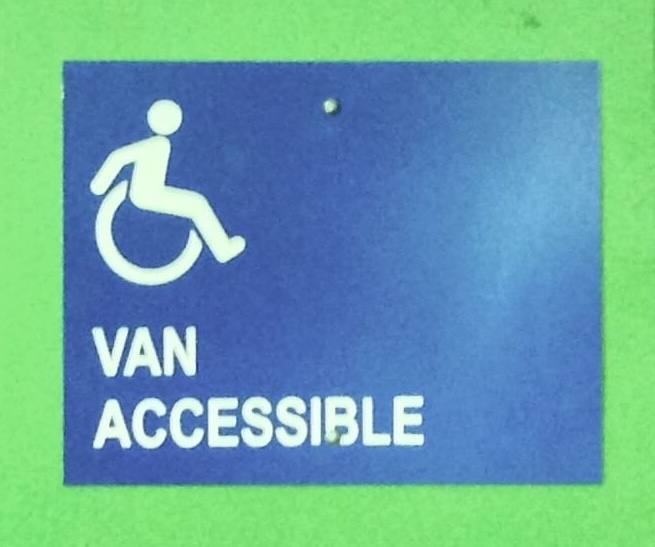
Top to bottom: California bank parking lot · TriMet transit car Portland OR (original source) · door button · de Young Museum · white sign drawing
Same meaning. Completely different message.
Both symbols meet code. One says "push me." The other says "I'm coming through." That difference matters — to every person who sees themselves in it.
Symbols carry meaning long after their creators are gone.
The original ISA was designed in 1968 by Susanne Koefoed, a Danish design student, for a Rehabilitation International competition. It was — remarkably — submitted without a head, and quickly corrected. It was never intended to be a permanent fixture. It became one anyway.
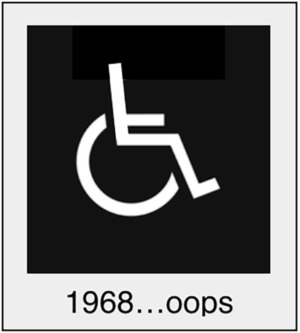
Rehabilitation International set global protocols for the symbol in 1978. The UN, ISO, the ADA, and building codes worldwide adopted it. It is now one of the five most recognized symbols on earth. And it still looks exactly like it did when Nixon was president.
Perceptions are shifting faster than any symbol. Images like these are everywhere now — on magazine covers, in Olympics coverage, in mainstream advertising. The perception of disability is turning the corner from marginal to mainstream cool, and the built environment's signage hasn't caught up.
If the ISA were a corporate symbol, it would have been updated decades ago.
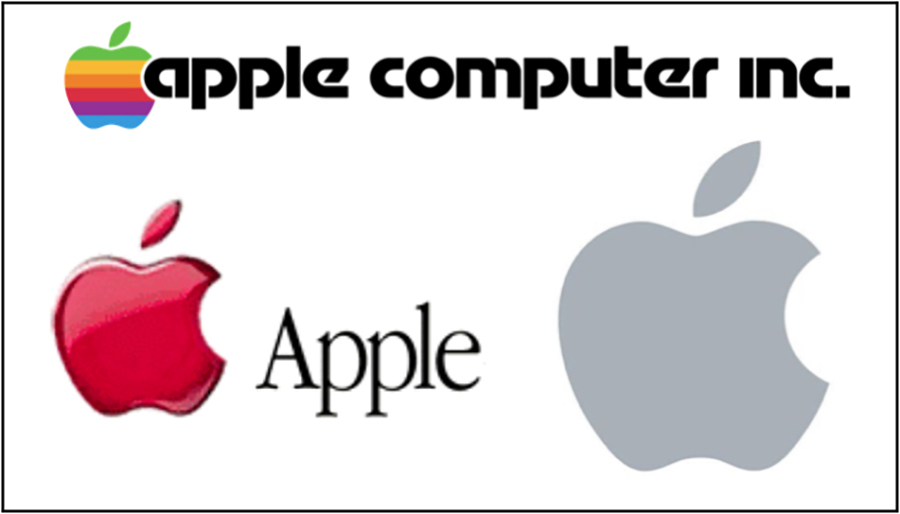
Apple's logo has evolved continuously since 1976 — from the rainbow "apple computer inc." mark, to the red glossy apple, to today's clean monochrome icon. Each change reflected where the company was going, not where it had been. The company never once said "it's recognizable, leave it alone."
The same is true of AT&T, UPS, every airline, every major bank. Symbols are updated because they communicate values, not just identity. The advertising industry understands this instinctively. It's time accessibility signage caught up. The original ISA has been unchanged for nearly 60 years — longer than the Newton logo Apple retired in 1977.
The original ISA communicates a value — passivity, dependence, being pushed — that no longer reflects the reality of disability. The Active ISA communicates what disability actually looks like today.
This isn't cosmetic. Every person who rolls past that symbol — every child who grows up seeing it — receives a message about who they are and what they're capable of. That message deserves an update.
It's not just a symbol. It's a statement.
Architects and building owners who adopt the Active ISA send a clear signal — about their values, their clients, and the kind of spaces they create.
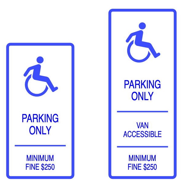
It's legally equivalent
Section 103 of the ADA and California's CBC 11B-103 explicitly permit alternative designs that provide substantially equivalent or greater accessibility. The Active ISA qualifies. Building officials across California have accepted it.
It reflects your clients accurately
Your clients who use wheelchairs are active, engaged participants in public life. The symbol on your building should say the same. The Active ISA shows the person as they are — leaning forward, self-directed, moving through the world on their own terms.
It's a small change with outsized meaning
It costs nothing more than the standard symbol. It requires no additional work. But it signals to every person with a disability who encounters your building that they were thought of — as a full person, not a liability to be accommodated.
The code already allows it.
Architects sometimes encounter resistance from building officials unfamiliar with the Active ISA. The legal basis is clear — and Mikiten Architecture has successfully used this symbol on permitted projects throughout California.
"Nothing in these requirements prevents the use of designs, products, or technologies as alternatives to those prescribed, provided they result in substantially equivalent or greater accessibility and usability."
The Active ISA communicates the same wayfinding information as the original — it identifies accessible features and routes — and it does so more accurately. It meets the Equivalent Facilitation standard in every jurisdiction where the ADA or CBC applies.
If you encounter a building official who questions it, we can help. See the consultation offer below.
Download. Use it. Spread it.
Everything you need to use the Active ISA on your next project — no strings attached. The more buildings that use it, the more normal it becomes.
Signage PDF
Print-ready signage files with the Active ISA at standard accessibility sign sizes. Ready for your sign fabricator.
Request DownloadCAD / DWG File
AutoCAD-compatible DWG file of the Active ISA symbol, ready to drop into your construction documents.
Request DownloadOne-Page Summary
A concise one-pager explaining the Active ISA, its legal basis, and its significance — useful for client presentations and building official meetings.
Request DownloadNeed help convincing a building official?
Erick Mikiten, FAIA has successfully navigated this conversation with dozens of plan checkers and building officials across California. If you're facing pushback on the Active ISA, we can help you make the case — with the right language, the right code citations, and firsthand experience.